Reassure
Whenever you sell someone something, you don’t merely tell them about your product and then wait for them to immediately buy it from you. Your prospects will always have questions after they hear your pitch. In sales, they call those objections.
A long time ago, we used to sell things to each other in person, one-on-one. This meant that once we told our customers about our product, we could hear out what they had to say, understand what exactly is holding them back, and then answer those questions for them.
Today, we sell things on the internet, globally, to thousands of people at the same time. Our website’s branding and copy tells a visitor about our product's story and benefits, but then they’re immediately shown a button to pay. We're skipping the objection handling part.
Which means that we spend a ton of money on ads and spam email lists mercilessly to drive people to our product page - people who will land on the page, read the copy, look at the photos, maybe even add to cart - but with the nagging questions in their head still unanswered, they close the window and leave without making a purchase, while we watch helplessly from the other side of the computer screen.
If only we could stop them while they’re on the verge of leaving. Imagine if we could reach out through their monitor, drag their cursor away from the exit button, and just ask them, “What’s holding you back? How can I help?”.
Introducing Reassure
(work in progress!)
Reassure tries to solve this problem by tackling customer anxieties during purchase consideration itself.
In its current form, Reassure is a popup that is shown to your prospects as they browse your page. Through it, you can answer the questions your prospects are most likely to have in their head while considering a purchase, but in a way that is much more visible and impactful than your usual website copy.
Here's a demo that I hope will better explain what I'm trying to say.
Roadmap
- Flesh out the admin part of the widget. It currently has functionality only to add stuff, will need to let users edit or delete as well.
- Figure out which button style to go with. The full-width seems a better choice aesthetically, but I've a gut feeling that the smaller button, by being "a bit off", could maybe make the user's brain focus on it and pay more attention to the text above it.
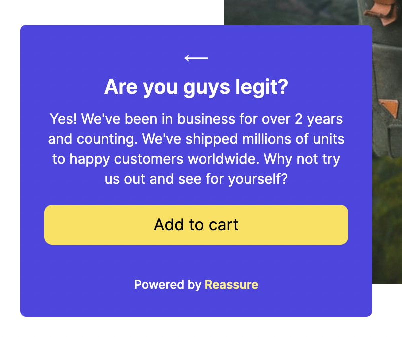
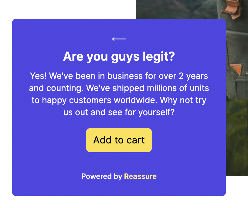
Update: went with the full-width one. Check it out in the demo, and let me know what you think.